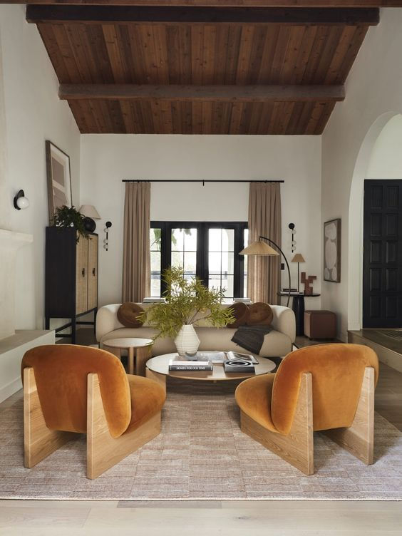
The Problem With Your Living Room Design That You Can’t Figure Out
- Raphaela Correa
- Oct 22, 2023
- 3 min read
I'd categorize scale as one of those unsexy, somewhat mathematical design principles that just happens to be very important. Without considering scale when designing your home, each room will feel disjointed, disproportionate, and just a bit off. Like balance, negative space, and flow, scale is a foundational principle of good interior design.
So, let’s start off with a basic definition: Scale refers to how the size of one object relates to the size of another in a space, and how those objects relate to the size of the overall room. Proportion is a word you might hear a lot when talking about scale, but the former is a little more specific: this design term typically refers to an object’s shape, and how that shape relates to other items in the room.
All you really need to know is that both scale and proportion highlight how design elements relate to one another in your space — and usually, you can use the terms interchangeably. Now that you know what scale means, here’s how to use it to elevate your home.
Goldilocks principle
Linking scale to the classic Goldilocks story; you don’t want anything that’s too big or too small, but rather just right. When things are ‘out of scale’—like a sofa that’s too large or too small for a space—the entire room feels out of balance.
Lean on the "Golden Ratio"
In layman’s terms, that simply means approaching your space in one-third or two-third measurements. Take your sofa and coffee table, for example: When thinking about scale and proportion, you’d ideally want your coffee table to take up about two-thirds the length of your sofa.
Other examples include choosing a side table that’s about one-third the size of a corresponding accent chair, hanging a statement piece of art that covers one-third of the wall, or installing a chandelier that’s either one-third or two-thirds the width of the dining table. “Golden Ratio” is more as a guiding framework rather than a hard-and-fast rule (because we believe those are meant to be broken), it’s a helpful way to visualize scale in your space and allow for better planning.
Start From the Bottom

While artwork, furniture, and accessories all benefit from thoughtful scale and proportion, one of the most important elements to consider is right under your feet.
When rugs aren’t proportional to the space, it easily throws off a design. Rugs should be large enough to fit at least the front two legs of all pieces of furniture on them. Not next to them—on them. When a piece floats off the rug, it’s a clear indication that you should size up.
& Work Your Way Up

Ceiling height can be a helpful tool for determining the size of pieces in a room. In general, rooms—even small ones—with higher ceilings look great with larger, more stately furniture, while rooms with lower ceilings do best with low pieces. This is an easy rule-of-thumb to consider when nailing scale and proportion throughout your home.
Don't Forget Negative Space
A part of that balance is breathing room. If every wall were decorated and every square-inch of space accounted for, a room would feel overwhelming and claustrophobic.. While in general, it’s better to choose pieces on the larger side (particularly for area rugs), be sure to leave a bit of blank space. Not only will this let other design elements shine, it will also keep a room from looking too busy.
- Raph


Comentários